
by Matthew | Apr 17, 2015 | Drawing, Process |
Because we are committed to no less than ten big creative projects (four volumes for Idiots’Books, six mailings for Bobbledy) each year, there’s not much time to rest in the barn.
Robbi is busy at work on the next Bobbledy title, A Hole in this Book, a story about a boy who is trying very hard to tell the reader something but who is constantly thwarted by the surprising and awful things that keep happening to him. If you are the sort who does not like suspense, I will assure you that things turn out all right in the end, but not before Robbi as illustrator/god does a doozy on his living room.

You can see from the process pic above that Robbi has drawn a sketch on her computer, has made a printout, and is now tracing the line work with pen and ink. You will also see a (nearly empty) bowl of almonds to her left. And not a bunch of candy wrappers. Also, I can attest that the empty glass beside the bowl was recently full of water—not Coke.
The girl is trying to reform herself. Lately, she has been sleeping at night and working in the daytime.
She still frequently forgets to eat lunch if I am not here to remind her, but let us celebrate the baby steps, shall we?
I’m excited about this new book and look forward to sharing it with you all soon.
by Matthew | Apr 13, 2015 | Drawing, Process
A few years ago, Robbi was coveting a particular kind of paint, a kind of transparent (but extremely concentrated) liquid watercolors that are extremely bright. One might even call them “brilliant.”
The paints in question are Dr. Ph. Martin’s Radiant Concentrated Watercolors.
Robbi was smitten, not only with the paints inside the bottle, but with the bottles themselves (so I suspected; she would never admit it).
And can you blame her? What a friendly little sucker. Like so many art supplies, there is a romantic pleasure in merely surrounding oneself with them.

Robbi spoke of Dr. Ph. Martin’s so often that it became clear that a gift was in order.
But which to buy?
Set A — Colors include Lemon Yellow, Orange, Persimmon, Alpine Rose, Scarlet, Cherry Red, Moss Rose, Turquoise Blue, True Blue, Violet, Grass Green, Juniper Green, Saddle Brown, and Black.

Set B — Colors include Daffodil Yellow, Amber Yellow, Tangerine, Crimson, Wild Rose, Cyclamen, Ultra Blue, Slate Blue, April Green, Moss Green, Olive Green, Golden Brown, Mahogany, and Sepia.

Set C — Colors include Tapestry, Pumpkin, Burnt Orange, Hyacinth Blue, Norway Blue, Chartreuse, Jungle Green, Tobacco Brown, Ice Pink, Tropic Gold, Tropic Pink, Ice Yellow, Calypso Green, and Antelope Brown.

Set D — Colors include Sunshine Yellow, Sunset Orange, Sunset Red, Sunrise Pink, Tahiti Red, Fuchsia, Raspberry, Ice Green, Ice Blue, Peacock Blue, Iris Blue, Indian Yellow, Tiger Yellow, and Coffee Brown.

It was a quandary I couldn’t easily resolve. I thought of asking Robbi herself, but it would have dampened the surprise. And so, I dug deep (into my pockets; these suckers are not cheap) and splurged to buy all four.
Sometimes it is impossible to choose among your children.

Years ago, Robbi’s delight was equal to my anticipation, and the cute little bottles quickly became a lovely display on a little shelf beside her desk. But they were put in use infrequently. As bright and as “radiant” as they are, they do not belong in every painting.
But lately, they have been brought out of retirement. But Robbi is not the one using them.
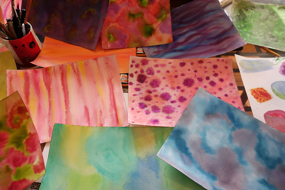
Every Thursday afternoon, we have the pleasure of hosting local superstar Maya Betley. In addition to folding, trimming, sorting, stacking, stuffing, and frequently smiling, Maya has been doing some painting for us.
In Robbi’s evolving children’s book style, she uses watercolor washes as backgrounds.

Or to build set pieces, so to speak.

[Note that both of the above images come from recent Bobbledy title The Luckiest.]
All those textures start out as washes of watercolor paint on textured paper. Then Robbi scans them in and uses them to create intricate collages, all on the computer.
But as Robbi’s children’s book oeuvre continues to grow, she needed more washes to sample among.
Enter Maya. Enter Dr. Ph. Martin’s. Enter sun-drenched hours in the letterpress studio. It is a divine union.

Over the past few weeks. Maya has been spending Thursday afternoons painting, painting, painting. Beautiful washes, textured landscapes, and contemplative moody abstractions that Robbi will use to make books in the months and years to come.

Let’s take a closer look. Just gorgeous.
 If you want to get your own set of Dr. Ph. Martin’s, head on over to Dick Blick and place your order.
If you want to get your own Maya, you’re out of luck.

by Robbi | Feb 7, 2015 | Process |
We’ve just finished up packing the latest Bobbledy Book, whose name cannot be revealed because it is the WINNER of the annual Bobbledy Books publishing contest! Once we’re sure the winner has received his/her book and the cat is out of the proverbial bag, we will do a post on the book and its author.
For now you get to look at how exciting it is to prepare a mailing. Whoo! (Can you tell that not much exciting happens around here?)
First up, every subscription comes with a letter from us. The letter has the latest news about what we’re up to or what’s coming up soon. This book’s letter included a drawing of artichoke aliens. Don’t ask – Matthew writes all the words and I just illustrate what he wrote. I also create a little activity sheet that usually has mazes or puzzles or something on it. This time around I did a puzzle about all the different types of worker bees (it was actually really fascinating doing the research for it) (and by “research” I mean looking at infographics and reading a wikipedia article).

The table in our studio gets buried in letters while we fold.

We didn’t get our packing done before the kids came home from school, so Alden did her homework while I labeled the envelopes.

Once all the envelopes are sealed up, labeled, and put in mailing bins, I put the stamps on. For some reason, I really like this part. I feel like part of a machine. A book-distributing machine, which is a pretty great machine to be a part of.

Included in this particular mailing are the certificates for those kids who submitted books to the contest (we got some great ones this year).

We are particularly fond of the gold seal (official, am I right?). Many years ago I found a notary stamp in the trash, so that’s what we’re using the stamp the certificates.

Don’t worry, I double-checked. John Reinke is retired and unless any of you are going to use these certificates in some sort of official capacity, I think we’re ok.

Also, I’m afraid some certificates got a less-than-impressive impression on them. That’s because Kato wanted to help. The kid gave it his all, but we need to work on his grip.
Thanks to everyone who submitted books to the contest – we’ll post more about it later in the month. For now, keep your eye on your mailboxes!

by Robbi | Jun 23, 2014 | Our Books, Process |
We are gearing up for our annual trek to Alaska – three weeks of commercial salmon fishing, which you can learn about in some detail HERE. This means we are scrambling to get ahead, or, at least, to not be so far behind when we return. So we’ve already almost finished our next book – due out August 1st. This means we are much farther ahead of the game than usual.
We’ve gone for a different format this time, and are trying our hand at our first kids-oriented mix-and-match book. As much as we would like to try to sell Ten Thousand Stories to kids, we recognize there’s some unsavory stuff in there. And as much as we would like to claim The Super Hero Squad Flips Out as our own, we recognize that nobody cares that we wrote it and that it really has very little to do with our [non-Marvel] universe.
And so, here’s a little introduction to our next book: Benji McBean and His Amazing Machines.
It’s basically about a kid (Benji McBean) and a bunch of different machines he’s constructed to take care of his problems. Like the “The Dish-Demolishing, Chore-Churning, Dust-Destroying Device,” for instance:

I started out about three weeks ago. Matthew had long ago written the text, so was already pretty much completely done with his part. It was lots of fun in the sketching stage to make up a bunch of different machines (there are eight). For a while I was trying to make them all mechanically feasible, but then I realized that I was putting ridiculous constraints on myself and I could pretty much do whatever I wanted. Once the sketches were done, I printed them out and put them on the light table and inked in my linework.

This guy is one of my favorites for his scrub brush hair.
So, at this stage, I basically ink and ink and ink like crazy. Usually in the wee hours, when no one is awake to bother me, and when it’s dark enough in the room that the light from the lightbox shines nicely through the paper:

Until I’m done:

And then I start in with the painting:

Which takes a VERY long time.
I try to keep myself alert by drinking lots of Coke and eating lots of ice cream and York Peppermint Patties:

I would not recommend this to anyone. After a couple weeks of this, I feel truly terrible. As evidenced by this photo:

All of this is to say: who knew that being an illustrator could be so bad for your health? I am suddenly regretting my decision back in 7th grade to become an illustrator instead of a professional basketball player.
More on this book to come.
In the meantime, please feel free to download the coloring page for the Dish Demolisher at this link HERE, or from the image below:

This one has lots of detail in it, so send me a picture when you’re done coloring! I’d love to see what you come up with.

by Robbi | Apr 26, 2014 | Drawing, Music, Process |
So, for those of you in the Bobbledy Books club, the next thing you’ll be receiving in the mail is this year’s album of music by our good friend Drew. Drew has been sending us snippets and chunks and tantalizing tidbits of songs for the past four months, and we’re finally putting the whole thing together. Let me tell you: there are some real gems on this album.
But, believe it or not, we had no trouble coming up with the name of the album. It sort of screamed to us when we were looking through the playlist.
And so [drum roll!] the album is named “Where is My Chicken?” after its title song, “Where is My Chicken?”. It all makes sense.
Now, it hasn’t been released yet, so you can’t buy it yet. And part of why it hasn’t been released yet is because I still have to make the album art for it.
I kind of had in my head from the start a chicken rocking out on the guitar. I talked over my ideas with Matthew, who suggested we really ought to have a rooster playing the guitar. It would just make more sense. And so the sketching began.
I started with a strutting rooster, but decided that he looked better standing straight on with his legs spread, like one does when hitting a power chord:


Once I got his position figured out, I drew in the lines a little darker. And I added some more detail in his tail feathers:


Then I started coloring him in. I did this drawing entirely on my computer – I just bought a set of Photoshop paintbrushes (HERE, if you’re interested) which I LOVE. It made the process go a lot faster than painting with a paintbrush.


Once I got him colored in, I decided all that detail in the rooster’s tail was just too busy. So I took out the outlines and just left the feather details. I kind of love how that worked out.


And finally, I added kind of a sunburst behind him, to make him really sing:

Of course, when I showed it to Matthew, the first thing he said was, “Well, we need to write Drew’s name on it somewhere, and we also need to put Bobbledy Books on there somewhere, and we also probably should include Brian (our friend who played a lot of the music on the album with Drew). And, um, isn’t the song ‘Where IS My Chicken?’ and not ‘Where’s My Chicken?'”
Dang.
Dang, dang, dang.
Sometimes I really zone out when I get into a zone!
Corrections and adjustments to come!
If any of you out there feel like drawing the album cover for an album called “Where Is My Chicken?” I would love to see it! Post it in the comments below, and maybe when you get your copy of the album in the mail, it will have YOUR cover on it, not mine!

by Robbi | May 28, 2013 | Process |
We got Drew’s album in the mail the other day. Opening big boxes full of finished books is always a little nerve-wracking, because we’re never quite sure how they’ve turned out – if the color is off somehow, or if there was some kind of printing mistake, or if someone spilled a bunch of glue on a stack of books or (the WORST) if we somehow missed a big mistake that WE made. The anxiety is even worse for a project that’s not entirely our own, and that someone else (namely, Drew) has invested a lot of time and energy into. So, we usually open boxes while holding our breath.

The album jacket looked great! Matthew was either happy or crazed!

No printing errors to be seen! And look at that lovely half-box full of discs! (we received a couple more boxes that were twice that size)

It wasn’t until I actually sat down to write this post and gloat about how there were no errors with this project (sadly, a pretty rare occurrence) that I realized I hadn’t actually taken out and looked at the disc itself. And found this:

Now, I know this isn’t really a big deal. In fact, in case you can’t even tell what the problem is, it’s that the “O” isn’t supposed to just be a solid oval, it’s actually supposed to have an empty middle like most “O”s do. BUT – it isn’t really what we asked (or paid) for, so it counts as an error. Ah well. Things don’t go perfectly every time, I suppose. In fact, it seems with our track record, things don’t go perfectly most of the time. But it’s not the end of the world.
[Basically] happy to have the album in hand, we realized that we’re coming to the end of our very first year of Bobbledy Books! Drew’s album is the last item to ship before we start the cycle over again with another book. This is exciting news, but also brings with it the sad reminder that some people will resubscribe and some probably won’t. We want to encourage people whose subscriptions are running out to re-up without being too annoying (hint hint hint). So we figured putting a bright, eye-catching sticker on the album would ensure that people would see the note without us having to send them too much extra stuff.
As usual, Matthew designed the sticker with some lowbrow sketching:

It didn’t seem complicated, so I went to work:

The first version, with black type on pink, got the thumbs down:

“Not bright enough!” he exclaimed.
The second version, with lime green type on pink got a so-so:

The final version, with lime green on pink and a turquoise bar got a “Yes! This hurts my eyes!!”

As you can see, they’re pretty much identical, but it took us half the day to get there.

Feeling satisfied, I arranged the design so it would print out on a sheet of labels, 30 to a sheet:

And pushed print. I only printed one sheet out because I haven’t done an actual count yet of how many people will need a resubscribe sticker. And it’s a good thing I only printed one sheet out, because it looks like our printer doesn’t quite print all the way to the right edge of the right column of stickers, leaving an unseemly white margin:

Argh! So, to save us from either having to trim down the right column of stickers or waste a bunch of stickers, I opted to just set up the design to print on two columns and leave the third blank. I can use the third column later to print up address labels.
Whew! So, great! This project is done! It only took up half the day! I was feeling pretty good about myself until I actually stuck one of the stickers onto one of the albums this morning when I started writing this post.

WHAT?! First off, this isn’t a book! It’s an album! What the heck?! How did we not notice that until now?!?!?!?! And second, that electric pink barely shows up on the red! What were we thinking??? Oy.
Matthew looked at it, and, defeated, suggested that nobody actually cares whether it’s a book or not. I insisted that though nobody cared, it’s still a pretty weird thing to have a sticker on an album that says it’s a book. After some heated discussion, we both realized that the operative information that actually needs to get across is that it’s time to resubscribe. SO – another bit of design wrangling and we came up with this:

Yeesh. Two days and a lot of headaches later, we finally have a stupid little sticker to remind people to resubscribe, and we both feel about ready to expire ourselves. With luck, we won’t ever need to design these again (it would be a big help if nobody ever let their subscriptions expire, hint hint hint. Plus, you’d get the added bonus of making even more work we did totally defunct).


